
Why Social Media Banners Get Cut Off
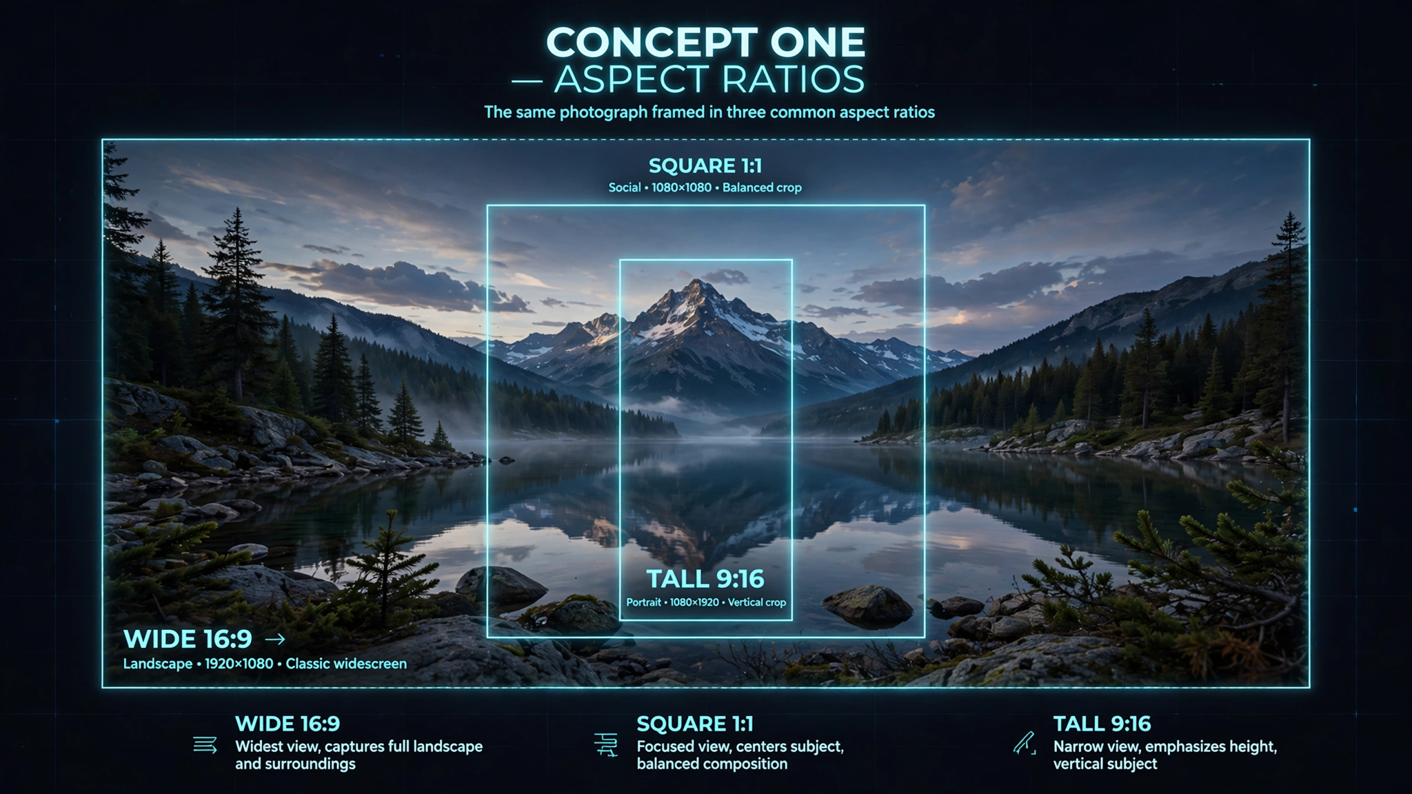
Have you ever spent hours creating a header graphic for LinkedIn, YouTube, or X (formerly Twitter), only to discover that your profile picture covers your company slogan or your contact details are chopped off on smartphones?
Social media platforms employ responsive fluid viewports. A banner designed for a 1920-pixel desktop monitor is automatically scaled down and cropped on a 375-pixel mobile device.
Essential 2026 Dimensions & Safe Zones
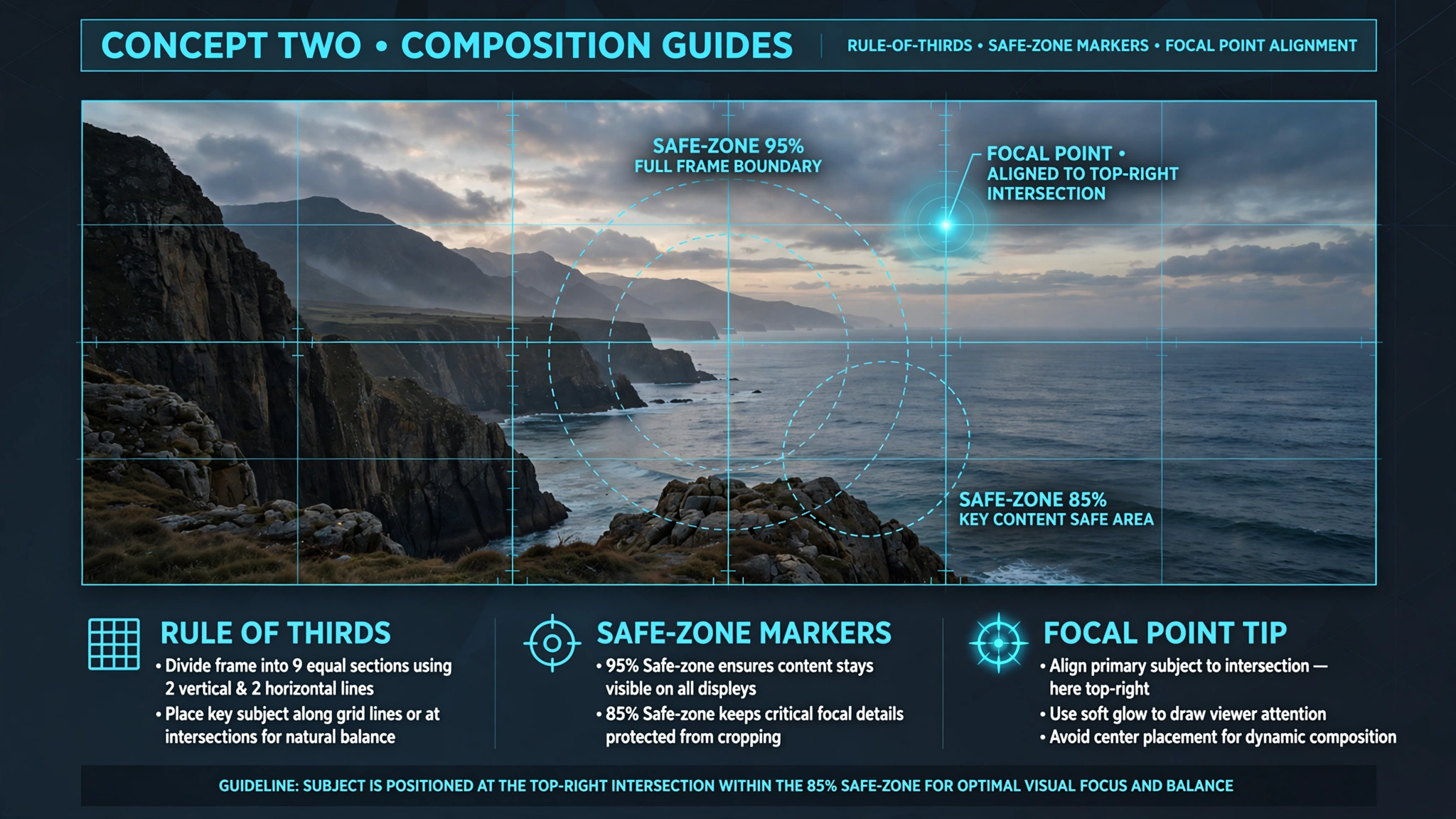
| Platform | Asset Type | Recommended Resolution | Aspect Ratio | Safe Zone Width |
|---|---|---|---|---|
| Personal Header | 1584 x 396 px | 4:1 | Central 1200 x 300 px | |
| Company Page | 1128 x 191 px | 5.9:1 | Avoid bottom-left corner | |
| YouTube | Channel Banner | 2560 x 1440 px | 16:9 | Central 1546 x 423 px |
| X / Twitter | Header Graphic | 1500 x 500 px | 3:1 | Leave bottom-left for avatar |
| Cover Photo | 820 x 312 px | 2.6:1 | Center 640 x 312 px |
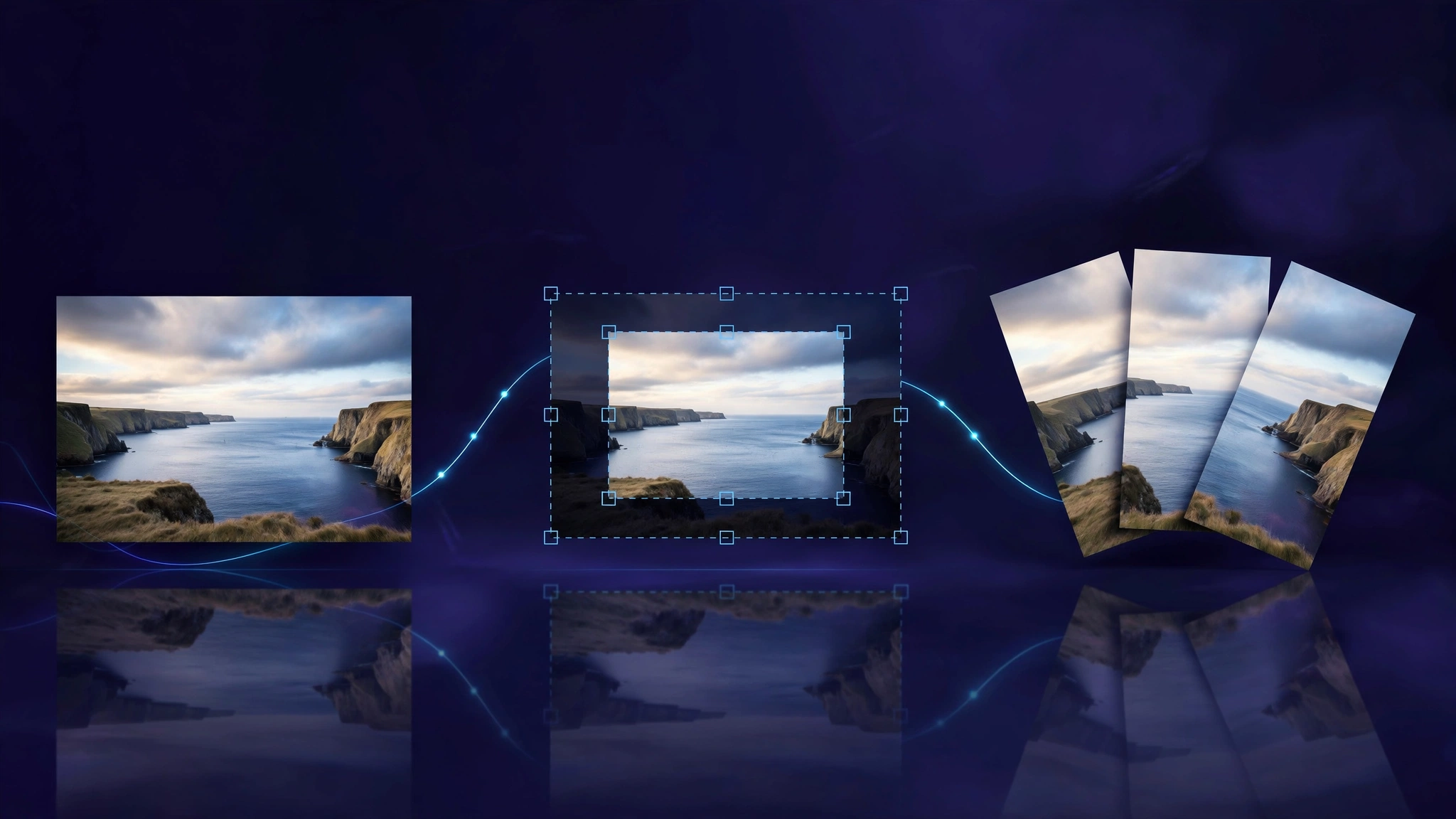
Step-by-Step: Cropping Without Pixel Distortion
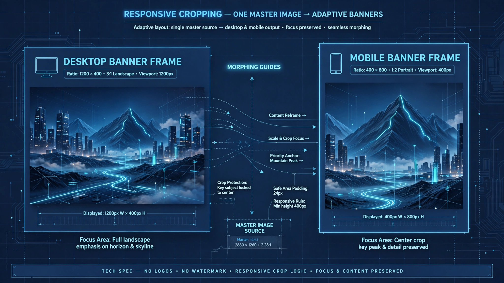
- Upload Your Image: Drag your high-resolution original into ToolDolfen's Image Cropper.
- Lock the Aspect Ratio: Select your required ratio (e.g., 16:9, 4:1, or 1:1 square).
- Align Key Elements in the Center: Keep critical text and faces inside the designated safe zone.
- Export Clean WebP or PNG: Download the cropped photo instantly without server lag.
Recommended Companion Guides
Explore complementary tutorials and utilities from this topic cluster to enhance your digital workflow:
Image Resizing Masterclass: How to Scale Pixels Without DistortionPractical step-by-step tutorial with verified standards and in-browser workflows.The Art of Photo Cropping: Aspect Ratios, Composition, and Exact DimensionsPractical step-by-step tutorial with verified standards and in-browser workflows.Regular Expressions for Beginners: Pattern Matching Made SimplePractical step-by-step tutorial with verified standards and in-browser workflows.Compress Image to 50KB: Signatures, Application Photos, and Document UploadsComplementary cross-format workflow connecting related data and media tools.