💡 Quick Summary & Key Takeaways
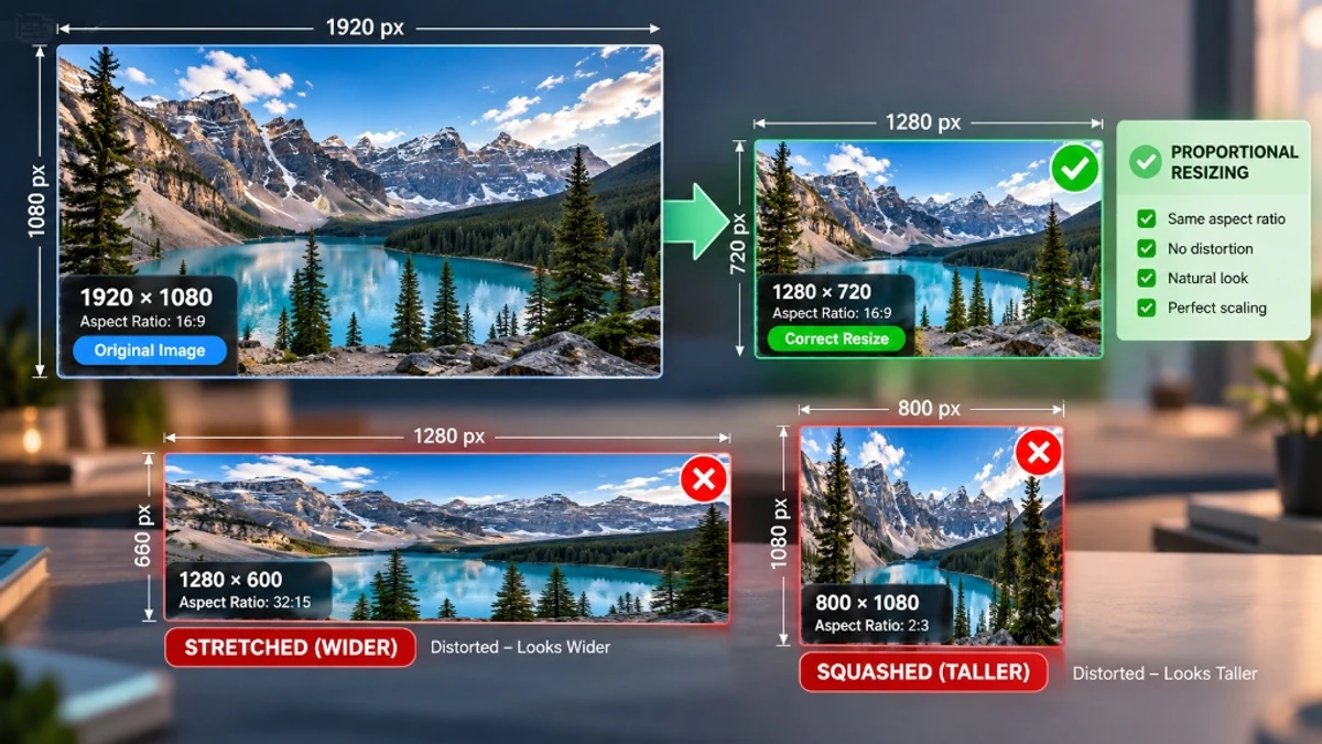
- Direct Answer: Resizing alters pixel geometry (width and height). To avoid stretching or squishing, always preserve the aspect ratio constraint (
width × originalheight / originalwidth).- Algorithm: Bicubic interpolation and multi-step downsampling provide smooth, anti-aliased edges when scaling graphics.
- Local Execution: 100% browser-based rendering ensures immediate feedback and complete data privacy.
- Instant Tool: Scale photos with the ToolDolfen Image Resizer.
Resizing vs. Compressing: The Fundamental Difference
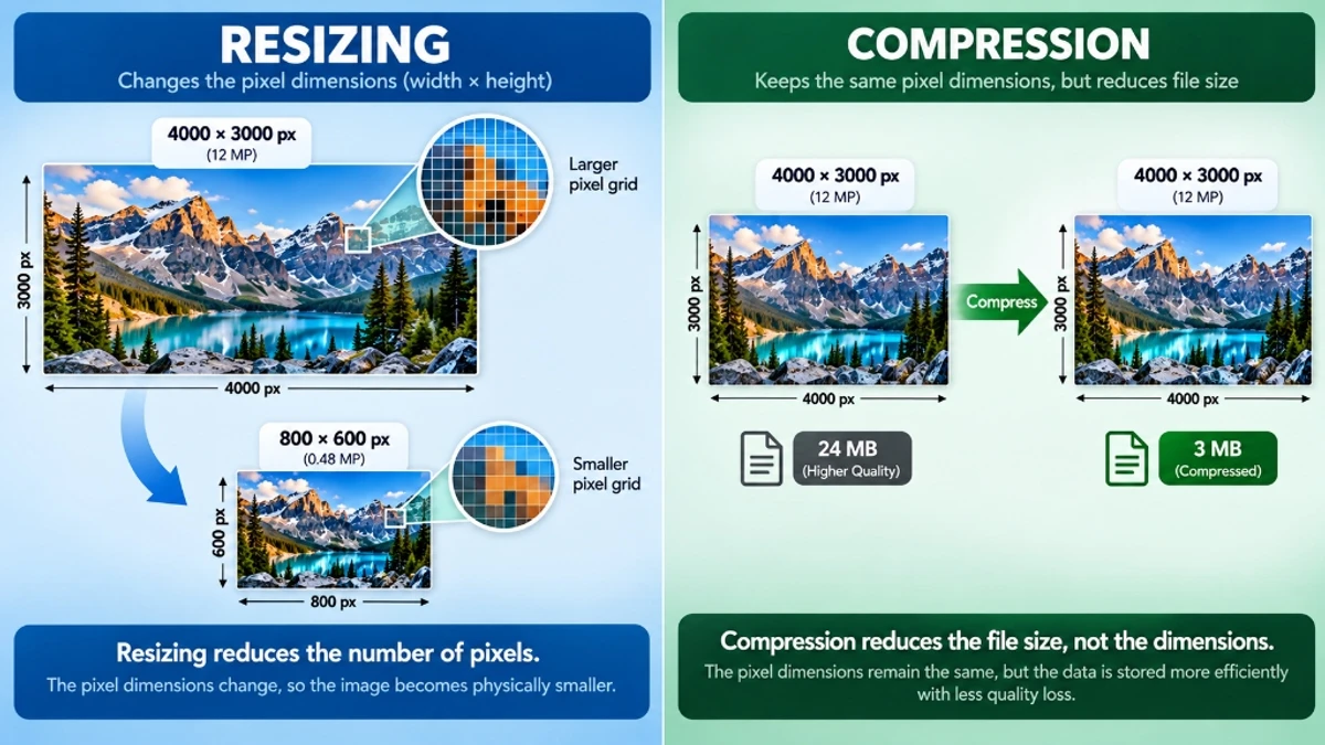
Two fundamentally different digital image operations are frequently conflated by content publishers:
- Resizing changes the physical pixel grid of your graphic. A 4000×3000 pixel image scaled down to 800×600 contains 96% fewer raw pixels. Resizing directly adjusts the canvas resolution, modifying display footprint and natural weight.
- Compressing preserves the exact pixel dimensions (e.g. remaining 4000×3000) while storing those identical coordinates using fewer bytes through mathematical approximations (lossy) or byte deduplication (lossless).
For university admissions portals, passport visa forms, and e-commerce listings, you often need both operations: resize first to meet required pixel caps, then compress to satisfy strict kilobyte file limits.
The Mathematics of Aspect Ratios (16:9, 4:3, 1:1, 3:2)
An aspect ratio denotes the proportional relationship between image width and height. When an image is resized without maintaining this exact ratio, subjects appear unnaturally stretched or squashed.
The fundamental aspect ratio formula:
New Height = (New Width ÷ Original Width) × Original HeightConsider an original photograph measuring 2400×1600 pixels (a 3:2 ratio). If you require a width of 800 pixels:
- New Height = (800 ÷ 2400) × 1600 = 533.33 px
- Scaled Dimensions: 800 × 533 px
Common aspect ratios across digital devices and publishing platforms:
| Aspect Ratio | Standard Resolution Examples | Common Use Cases |
|---|---|---|
| 16:9 | 1920×1080, 1280×720, 3840×2160 | YouTube thumbnails, desktop hero banners, widescreen video |
| 4:3 | 1600×1200, 1024×768, 800×600 | Presentation slides, legacy tablet displays, document scans |
| 1:1 | 1080×1080, 800×800, 500×500 | Instagram square feeds, profile avatars, product catalogs |
| 3:2 | 3000×2000, 1500×1000, 600×400 | DSLR camera sensors, 4×6 photographic prints |
| 9:16 | 1080×1920, 720×1280 | Instagram Stories, TikTok videos, YouTube Shorts, mobile lock screens |

Bicubic vs. Nearest Neighbor: How Pixel Interpolation Works
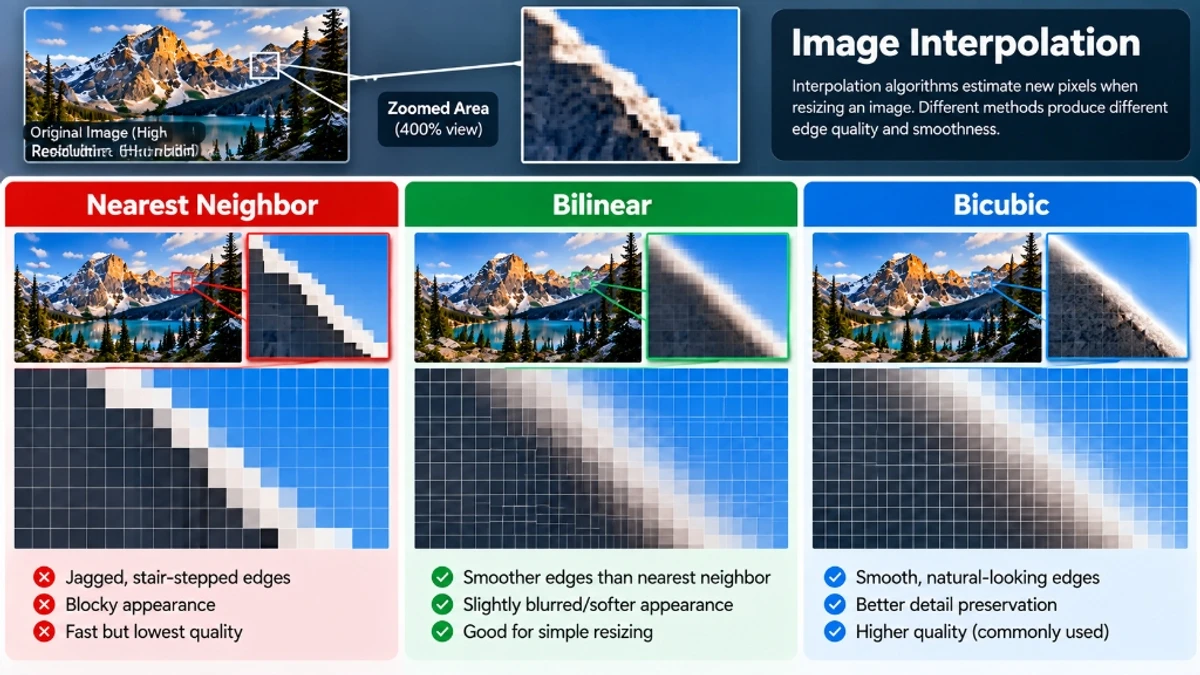
When downscaling an image from 4000 pixels down to 800 pixels, the rendering engine must decide how to sample the surplus 3200 pixels. The chosen mathematical interpolation algorithm dictates output sharpness:
- Nearest Neighbor: The most rudimentary algorithm. For each output coordinate, it picks the nearest single pixel. While computationally instantaneous, it produces severe jaggedness ("staircasing") along diagonal curves.
- Bilinear Interpolation: Evaluates a 2×2 grid of four neighboring pixels, calculating an average color value. This produces smoother gradients but can yield slightly blurry high-frequency transitions.
- Bicubic Resampling: Samples a 4×4 grid comprising sixteen neighboring pixels, applying a cubic spline polynomial weight. Bicubic produces sharp, natural edges without aliasing artifacts, serving as the gold standard in Adobe Photoshop and ToolDolfen Image Resizer.
ToolDolfen's client-side canvas engine leverages hardware-accelerated bicubic interpolation directly in your browser, generating crisp downscaled graphics in milliseconds without uploading your confidential files to external servers.
Step-by-Step: Resizing Images Cleanly on ToolDolfen
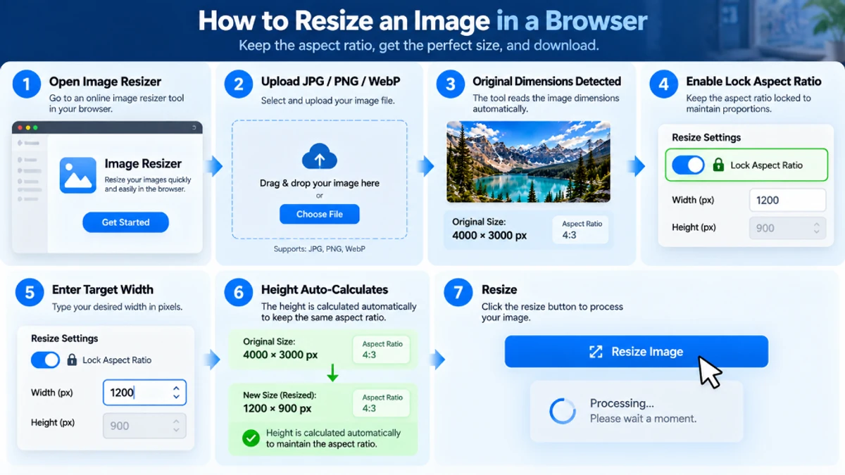
- Navigate to the free ToolDolfen Image Resizer.
- Drag and drop your JPG, PNG, or WebP photo into the workspace. The tool automatically detects and displays your existing dimensions.
- Verify that the Lock Aspect Ratio switch is enabled (active by default).
- Enter your target width (e.g., 1200 for a blog feature image). Notice how the height field auto-calculates instantly.
- If you need to cut out specific parts of the image to fit a rigid square or banner ratio before resizing, use the Image Cropper.
- Click Download Resized Image to save the optimized file directly to your disk.
Standard Web and Social Media Dimension Cheat Sheet
Bookmark this cheat sheet when preparing graphics across popular platforms:
| Platform | Asset Type | Recommended Pixel Dimensions | Aspect Ratio |
|---|---|---|---|
| Square Post | 1080 × 1080 px | 1:1 | |
| Portrait Post | 1080 × 1350 px | 4:5 | |
| Instagram / TikTok | Story / Reel | 1080 × 1920 px | 9:16 |
| Feed Shared Image | 1200 × 630 px | 1.91:1 | |
| X (Twitter) | Timeline Post | 1200 × 675 px | 16:9 |
| Blog / Link Share | 1200 × 627 px | 1.91:1 | |
| YouTube | Video Thumbnail | 1280 × 720 px | 16:9 |
| Web Banner | Desktop Hero Header | 1920 × 600 px | 16:5 |

If your resized image still exceeds email attachment limits or visa portal rules, process it through the Image Compressor or the dedicated Compress to 100KB utility.
Recommended Companion Guides
Explore complementary tutorials and utilities from this topic cluster to enhance your digital workflow: